



The HTTP Archive’s 2025 Web Almanac found that only 48% of mobile sites achieved good Core Web Vitals (as reported by RankAI). That means more than half of the sites competing for your customers load slowly, shift around, or respond late on a phone, and many of them belong to businesses like yours.
It matters because Google primarily uses the mobile version of your pages for indexing and ranking, and since July 2024 it crawls all sites with its smartphone crawler. Below are 12 fixes, a list of free tools, a 90-day plan, and advice on when to hire help.
12 Mobile SEO Fixes to Improve Mobile Performance and Rankings
We ordered these by how often each one costs small businesses visitors or calls, and how easy it is to fix. That’s our judgment, not a Google ranking order.
1. Make sure mobile shows the same content as desktop
Under mobile-first indexing, Google uses what your mobile page exposes: the text, headings, links, and structured data. If your phone version hides content or drops links that desktop has, Google has less to work with. Keep the same primary content, internal links, and structured data on both. Don’t add a noindex or nofollow to the mobile version only, which can stop indexing entirely.
2. Use responsive design and the viewport tag
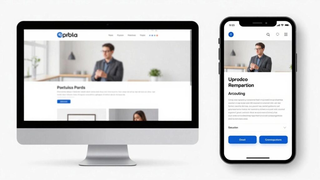
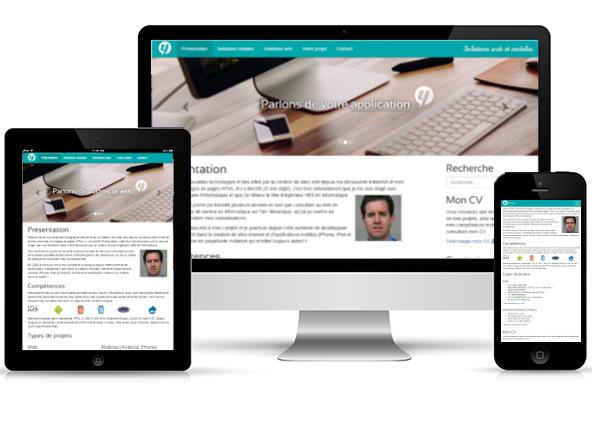
A responsive site adapts one set of pages to any screen. Confirm your pages include <meta name="viewport" content="width=device-width, initial-scale=1"> in the head. Without it, phones may show a shrunken desktop page. You don’t need a separate mobile site.
3. Speed up your largest element (LCP)
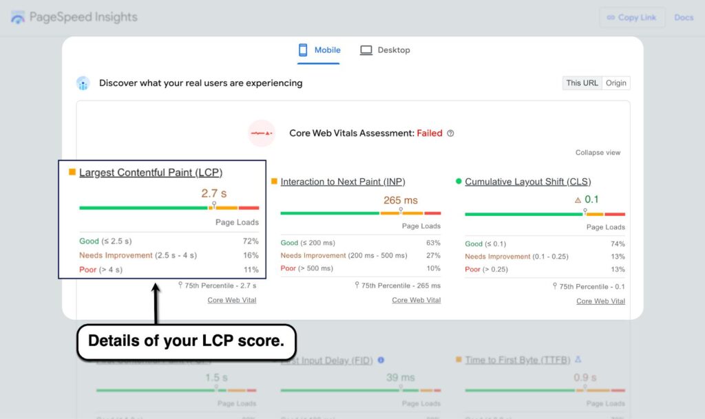
Google’s Core Web Vitals “good” threshold for Largest Contentful Paint is 2.5 seconds or less, measured at the 75th percentile of real visits. On most small business sites the culprit is a huge hero image.
- Resize and compress images, and serve modern formats.
- Don’t lazy-load the image at the top of the page.
- Use caching and a host with fast response times, and remove plugins you don’t need.
4. Stop layout shifts (CLS)
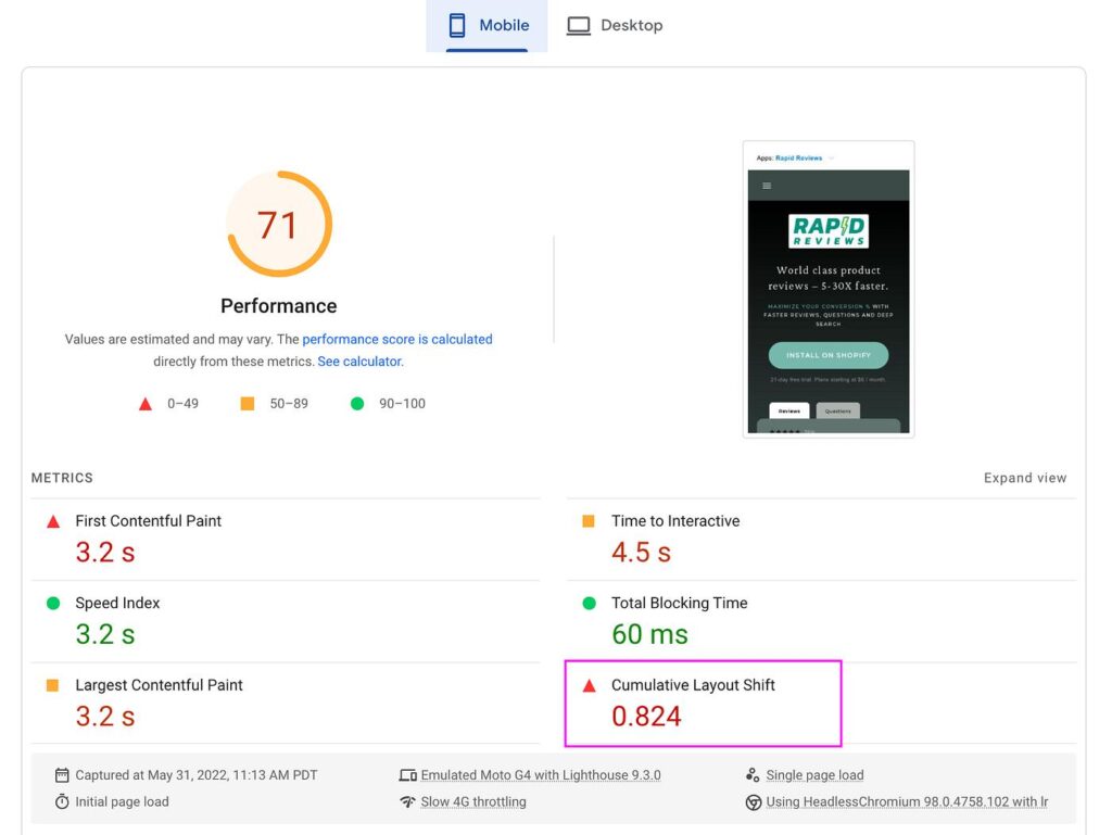
The “good” threshold for Cumulative Layout Shift is 0.1 or less. Give images and videos set dimensions, reserve space for banners, and avoid late-loading fonts that make text jump. Few things frustrate a person tapping “Call now” more than a button that moves.
5. Make taps and typing fast (INP)
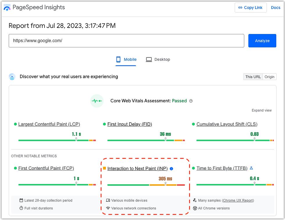
Interaction to Next Paint should be 200 milliseconds or less. It replaced First Input Delay on March 12, 2024. Heavy scripts are the usual cause, so trim chat widgets, extra trackers, and sliders, and defer what you can.
6. Size text and buttons for thumbs
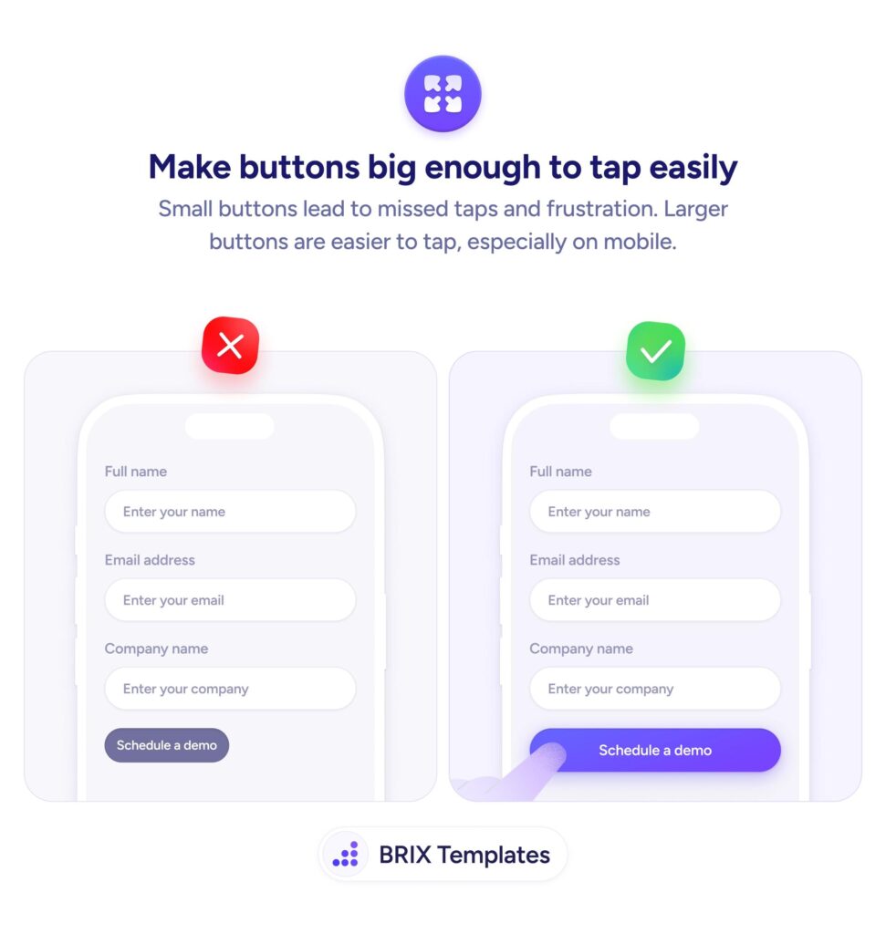
Use readable text without zooming, enough space between links, and tap targets around 48 pixels, a common audit guideline. Check forms too: use the right keyboard type for phone and email fields.
7. Put call, directions, and booking at the top
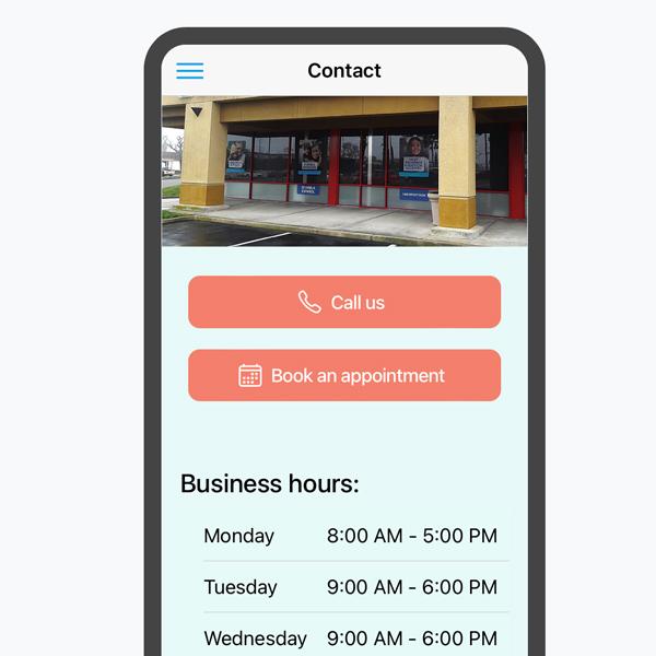
For local businesses, the phone is the conversion. Use a click-to-call link on your phone number, a directions link, and a visible booking button on every page. Test them on a real phone.
8. Remove intrusive pop-ups
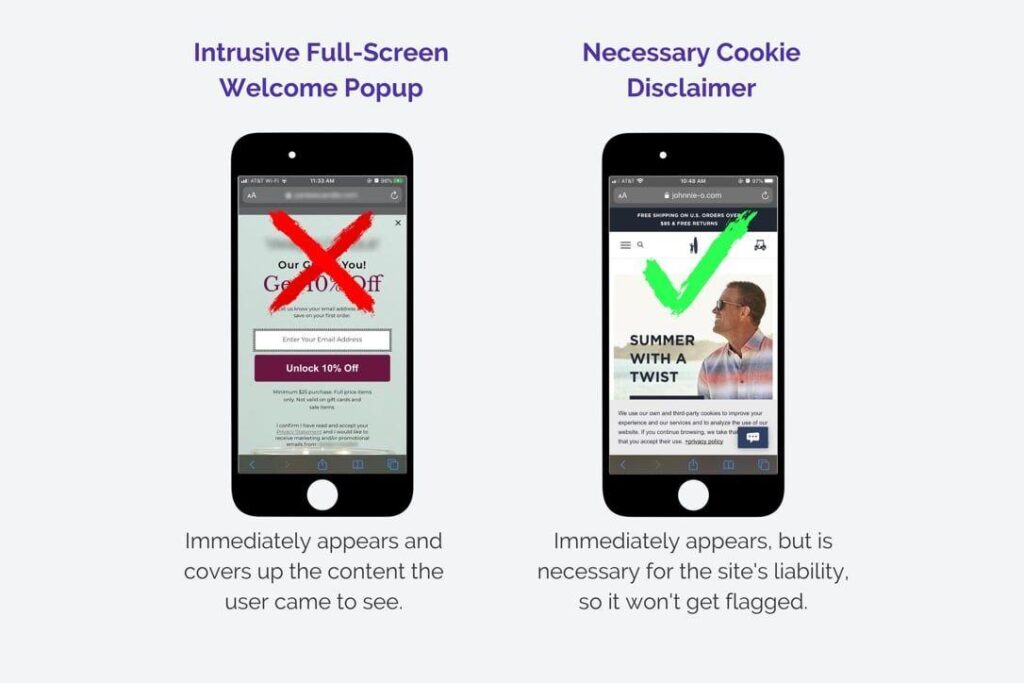
Full-screen pop-ups that cover the content as soon as someone arrives from search frustrate visitors, and Google has long advised against intrusive interstitials. A small banner or a delayed prompt is safer.
9. Build mobile-friendly service and city pages
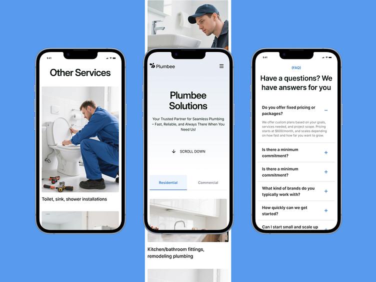
Put your service, city, phone, hours, and booking button where a phone user sees them first, with short paragraphs and clear headings. Keep your name, address, and phone number (NAP) identical to your Google Business Profile and listings. Each page needs unique content, not copies with the city swapped. Our guides to local seo for dentists and local seo for restaurants show this applied. For restaurants, a text menu beats a PDF that’s tiny on a phone.
10. Add LocalBusiness structured data
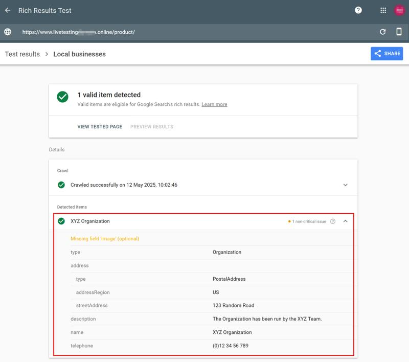
Markup tells search engines your name, address, phone, hours, and URL in a machine-readable way. Use LocalBusiness or a more specific type, include it on the mobile version, and make sure it matches the visible page and your profile.
11. Don’t block what Google needs
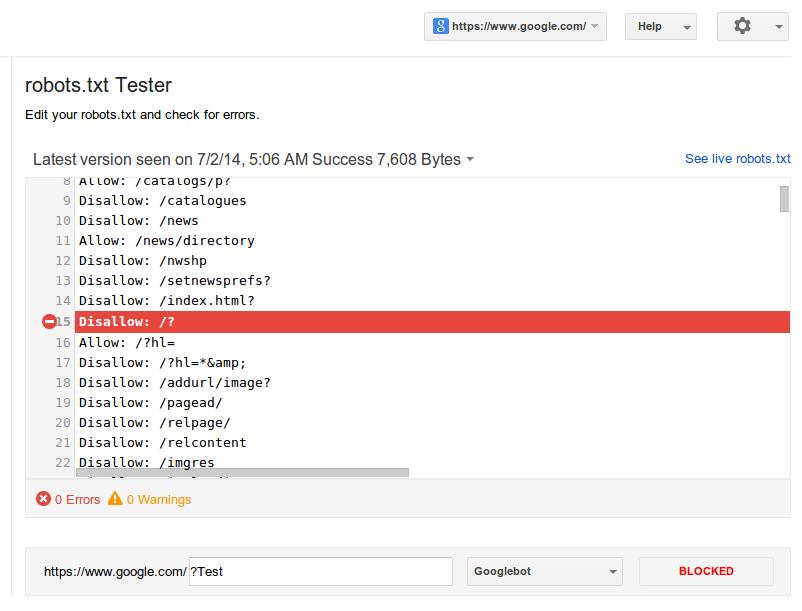
Make sure your robots rules don’t block CSS, JavaScript, or images that the mobile page needs to render. Use the URL Inspection tool in Search Console to see how Google views a page, and fix pages that look different from what visitors see.
12. Check that your Google Business Profile points to a mobile-ready page
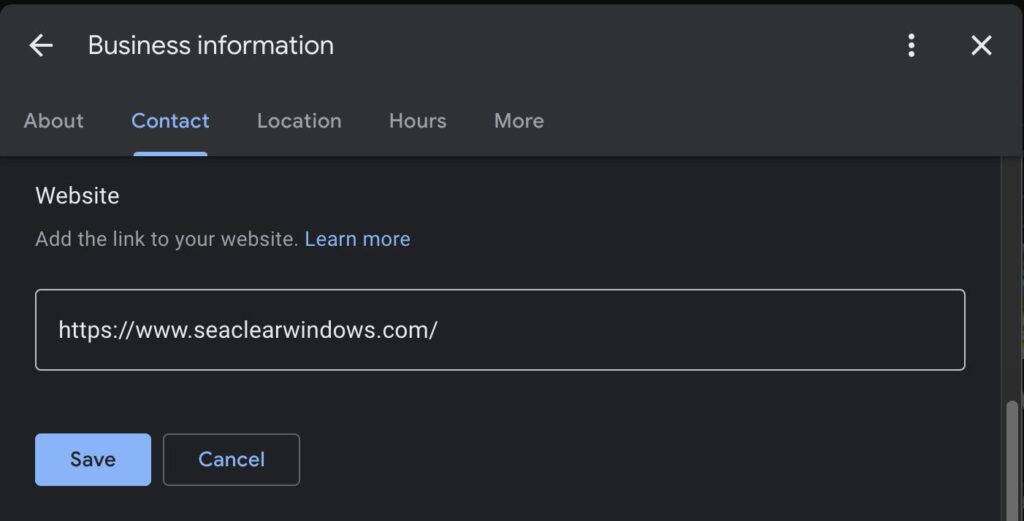
Many local searches happen on a phone and start from your profile, so the website, booking, and menu links should open fast pages that work on small screens. Keep hours and photos current. Google says there’s no way to request or pay for a better local ranking, so the profile and page quality are what you control.
Free Tools to Check Your Work
- Google Search Console: its Core Web Vitals report shows real-user mobile results grouped by page type, and the URL Inspection tool shows how Google sees a page. Search performance data shows which searches bring visitors.
- PageSpeed Insights: combines real-user data with a lab test on the mobile tab, and lists specific fixes.
- Lighthouse in Chrome DevTools: choose the mobile preset to audit speed, accessibility, and usability.
- Google Business Profile: its performance data shows calls, directions, and website clicks from your listing.
- A real phone: test calls, forms, and booking on an actual device, on mobile data, not only Wi-Fi.
Note that Google retired its standalone Mobile-Friendly Test and the Mobile Usability report in Search Console on December 1, 2023, and confirmed it on December 4. If an article tells you to run them, it’s out of date. Google points to Lighthouse instead.
Mistakes to Avoid
- Designing for desktop and shrinking it. Start with the phone view.
- Chasing a perfect score. Google says good Core Web Vitals help but don’t guarantee rankings, and a relevant page with a weaker experience can still rank. Fix real problems, and don’t obsess over a number.
- Trusting lab scores alone. Field data from real visitors is what matters most.
- Stuffing the page with widgets. Every chat bubble and tracker costs speed.
- Hiding the phone number or booking button. If it takes three taps, you lose people.
- Ignoring local basics. A fast site with an inconsistent NAP or an unclaimed profile still struggles in the local pack.
- Believing guarantees. Anyone who promises a ranking can’t deliver one.
Your 30-60-90 Day Plan
☐ Test the site on your phone
☐ Run PageSpeed Insights on the home page and top service pages
☐ Confirm the viewport tag and parity (fixes 1 and 2)
☐ Add click-to-call and booking buttons (7)
☐ Remove intrusive pop-ups (8)
☐ Compress images (3)
☐ Reserve space to stop layout shifts (4)
☐ Trim heavy scripts (5)
☐ Add LocalBusiness markup (10)
☐ Check Search Console’s Core Web Vitals report
☐ Improve service and city pages (9)
☐ Check your profile’s links and your NAP everywhere (12)
☐ Track calls, directions, and clicks
☐ Check rankings on a phone from nearby locations, since results vary by location
☐ Plan the next quarter
Review your numbers monthly. Mobile fixes can lift calls and bookings quickly, but search rankings usually take months, and nobody controls Google’s results.
FAQ: Mobile SEO
What is mobile-first indexing?
Google primarily uses the mobile version of your pages for indexing and ranking, so content missing on mobile can be missed entirely.
Is mobile-friendly the same as mobile-first?
No. Mobile-first indexing is which version Google uses. Mobile-friendliness and Core Web Vitals are about how usable and fast that version is.
What replaced Google’s Mobile-Friendly Test?
Google retired it on December 1, 2023, and points to Lighthouse. PageSpeed Insights and Search Console’s Core Web Vitals report cover much of the same ground.
What are good Core Web Vitals scores?
LCP of 2.5 seconds or less, INP of 200 milliseconds or less, and CLS of 0.1 or less, measured at the 75th percentile of real-user data.
Do I need a separate mobile site?
No. A responsive site that serves the same content to every device is simpler and easier to keep consistent.
Does Google Ads help my SEO?
Not directly. Google says you can’t pay for a better local ranking.
Start With Your Phone
Open your site on your own phone today and try to call or book. Fix what slows you down first, then work through the checklist. For help with mobile and local search, explore our local SEO service.
Sources (checked Oct 2026): RankAI, Mobile First Indexing best practices (cites Google and the HTTP Archive 2025 Web Almanac) · RankAI, mobile-first indexing 2026 checklist · SEOJuice, Mobile SEO (INP replaced FID, Mar 12, 2024) · AOK Marketing, mobile and Core Web Vitals (cites Google Search Central, web.dev) · Search Engine Land, Google drops Mobile Usability report and Mobile-Friendly Test (Dec 4, 2023) · Google Search Central Blog, Mobile Friendly Test (retired) · Google Business Profile Help, Improve your local ranking. Thresholds, tools, and Google guidance change, and rankings can’t be guaranteed. This article is general information. Core Web Vitals and mobile-first details are summarized from Google guidance via third-party sources, so confirm them on Google Search Central and web.dev.